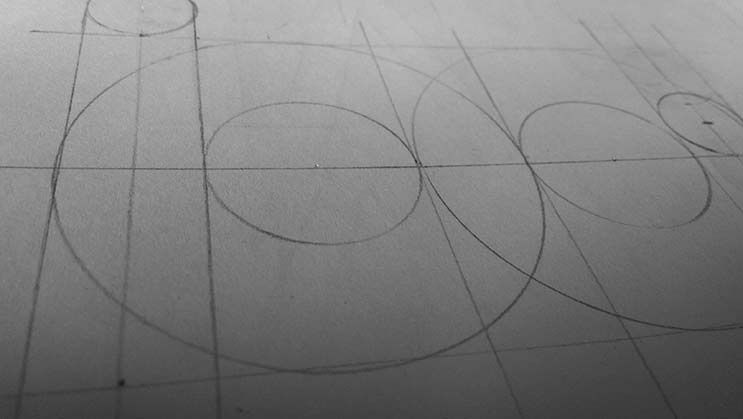
A logo wireframe
Since the redesign of my website (somewhere october 2013) I have been using a new logo, as can be seen in the upper left corner. Although not being a graphic designer, I think it works really well: it has my initials, it is simple and it doesn’t look too bad. There is only one more thing I wanted to do: wireframe it.

Somehow I managed to create this logo with just a compass, a ruler and a sharp pencil. It took me about two afternoons of work and some feedback from the (awesome) guys from the NHL in Leeuwarden I work with at the moment. I think real designers would make a wireframe upfront and re‐iterate the whole thing over and over again, but since I am not very capable at Illustrator I just, well, threw in some lines. As you can clearly see: some lines do not overlap and some overlap too much.
This post isn’t digging deep into anything, because I just like to show this piece of work, of which I’m a bit proud. I should go back to developing stuff now. Let the real designers do the work.